Sunday, February 27, 2011

Alchemy

Hi, All! We had a couple of reasonably warm days earlier in the week (considering it is winter in Central Oregon, so above freezing during the day!) and I played at my workbench making the kraft paper background above. It was the wrapping on a wonderful piece of hand-made paper!

I crumpled it, smoothed it out and crumpled it again, and then painted it with a wash of black coffee. I only needed a slurp so Chris was happy to oblige and drink the rest. The color wasn't strong enough so while it was still wet I sprinkled instant coffee powder -- that made the lighter brown splotches.

It was still a bit boring, so once it was dry, I stenciled burnt umber acrylic paint through sequin waste and randomly stamped with a sea sponge. Scanned it in and started to play in Photoshop.

Remember the watercolor and acrylic background I showed you in "Pixels and Paint"? I layered that with the kraft paper background, played with blending modes and got this:

Since the result was so magical, I call it "Alchemy." If you look closely, you will see bits of writing layered in -- I used a bit of text from an old alchemy manual (Wikimedia Commons) and a scrap of a letter written in a foreign language I got as a freebie somewhere along the way. How cool is that? I have printed the image several times on photofabric and want to turn it into a small art quilt. Stay tuned!

Monday, February 21, 2011

Too Late -- I Couldn't Resist! (Photoshop Strikes Again)

What do you get when you mix paint, gel medium, lace, texture gels and stir with magic wand???

I call this Dark Mysteries -- isn't it scrumptious???

I'm shutting down my computer now, I promise!

Stop Me Before I Photoshop Again! (More Fun with Textures)


Playing with textures in Photoshop is so much fun, I never want to quit! :-)

I desaturated the watercolor and acrylic background from my last posting (turned it to greyscale) and layered it with a scan of linen-look blinds. I thought it had a lot of potential, but when I tried it on a couple of images, it didn't do a thing! (As an aside, isn't it interesting how our eyes/brains read watercolor as very sheer, but the scan shows a lot of pigment).

Since the images I tried were quite colorful, I tried again with an image with a very light background. The changes are very subtle and I don't know if they will print on fabric very well, but it could make a pretty postcard:

Wishing you a creative, inspiration filled day!

Sunday, February 20, 2011

Ghost Fish in a Fantasy Pool

Just finished this little quilt -- the black fish border didn't exactly work, but done is good! I quilted ghost fish in the green borders and I hope they have fun swimming in the fantasy garden I've created for them. On to my lighthouse quilt...

Saturday, February 19, 2011

Paint and Pixels, Part Two

Yesterday I painted some bubble wrap and "stamped" on my watercolor background. I could have used a wee bit more paint but I like that the actual texture on the bubbles printed (and no messy paint "blurps"). So far so good: applying the acrylic very gently didn't disturb the watercolor at all and it added some interesting texture.

The whole point of this exercise was to see if I could paint a background with watercolor and acrylic, then run it through the inkjet printer, and this is where I'm less pleased with the results. After the acrylic dried, I used a foam brush to apply a layer of inkAID semi-gloss precoat (as directed in Digital Art Studio by Schminke, Krause and Lhotka). The inkAID is fairly viscous, and the watercolor smeared when I tried to even out the layer. When I didn't try to even out precoat layer, it dried very glossy in spots. The paper was quite bowed when it dried, so I let it sit overnight underneath a large weighted marble tile.

My test print was created in Photoshop using a few digital brushes. The butterfly, dragonfly and plant images were stamped at 100% opacity, while the two water spots were done at 65% opacity and flow. I wasn't sure how my little Canon printer would handle 140-lb watercolor paper (especially with a little residual curl), but it printed quite nicely. The print head caught the edges a wee bit, but trimming 1/8" from each side would take care of that.

It was an interesting experiment -- I loved painting the watercolor background and am so glad I scanned it before messing around more. I'm looking forward to making and scanning more of those and incorporating them into digital textures. Once the background is done and it is time to add digital stamps and/or images, I'd either do it all in Photoshop and print on photofabric (EQ Printables), or print the background and then use a digital ground on a sheer fabric to create an overlay. I haven't tried inkAID on fabric yet, but I'm leaning toward Golden Digital Ground because I think it would preserve the hand of the fabric much better (it isn't as gooey).

I hope that was interesting and useful. Wishing you a wonderful weekend of art!

Thursday, February 17, 2011

Playing with Paint and Pixels

Hello, there! I've wanted to make some of my own backgrounds for a while, so I dug out my watercolor paints this afternoon and started playing. I decided to work with analogous color in the warm half of the palette. I'm still a watercolor rookie -- things dried out much faster than I expected and I didn't get much mixing. Since I ADORE splatter painting, I just had to add some while I still had paint on my brush! I scanned it at 300 dpi in case my next layer looks yucky...


Before I add more paint (my workbench is covered with silkscreens that just got their last coat of varnish!), I thought it would be fun to tweak the image a bit in Photoshop. I dragged my painting into a new postcard file, selected one of the red-orange colors and used a digital brush to grunge it up a bit. I set the brush at 50% opacity and it evened out the colors and toned down the brightness quite nicely. I can't wait to print this on fabric and use it as a postcard base!

Bedtime -- I'll post again soon!

Monday, February 14, 2011

In the Kitchen with a Paintbrush

Hello! I hope you're all having a wonderful day. It is gray and dreary here but I have lots of fun projects to do inside so I'm not going to let a little thing like the weather get me down (plus I've had too much caffeine...!)

A couple of days ago I wanted to get some fabric ready for a project I have in mind, so I decided to whip up a flour resist. I mixed one cup general purpose wheat flour (not whole wheat) with one cup of cold water together until it was the consistency of pancake batter ("recipe" from Jane Dunnewold's latest book Art Cloth). I used a whisk to get most of the lumps out. That's as close as I try to get to real cooking!

I had a piece of boring mauve pink hand-dye (batik) pinned to my "print board" (June Tailor "Quilters Cut & Press" with a rotary mat on one side and padded surface on the front). I had an extra piece of muslin wrapped around the padded surface to catch drips but I don't really care if a little paint leaks through.

The batik is approximately 11" x 18" -- larger would be nice, but that fits on the board. Per Jane's directions, I pinned the top of the fabric to the board but left the other three sides loose. I poured about half the flour batter on the fabric and used an old credit card to smooth the resist into a fairly thin layer -- just thick enough so the underlying color was barely visible, but not as thick as frosting between layers of a cake. :-) Half a batch would have been perfect for a piece of fabric that size.

The fabric stretches quite a bit when the resist is applied, but then shrinks considerably as it dries. I used those large "quilters pins" and some of them bent by the time everything was dry!
I let the fabric dry overnight and then got ready to paint.

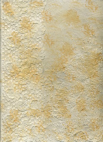
The fabric was quite stiff and the resist felt like a sheet of egg shells -- cool but a little difficult to work with. I held the fabric over a trash can to catch any bits of resist, but very little actually came off. I scrunched it quite a bit to get it to crackle -- Jane warns against being too aggressive and I can see why. Fine hairline cracks will yield the most interesting texture but I crunched until I could see the fabric in a few places.

I used three colors of Dye-Na-Flow fabric paint: magenta, cranberry red and claret. I picked that paint because it is very thin (watery) but highly saturated so it should work its way into all the nooks and crannies. I worked it in to the resist and made sure the surface got thoroughly wet. Here's what it looks like from the front:

The paint takes about 2 weeks to air cure (possibly less since there isn't as much binder in this particular paint). The flour will wash out, but since I can't really heat-set the fabric with the flour on it, we'll just have to wait. Here is what the back looks like -- you can tell where I went overboard scrunching. I really worked the paint in, but it spread under the resist in the open areas more than I expected:

It is a fun process and I'm looking forward to doing it again soon. It definitely isn't instant gratification, though!

Sunday, February 13, 2011

UFO No More... (I Hope!)


I dug this piece out of my UFO pile -- I started it in a class several years ago. The original project was an embellished purse, but I just don't enjoy that kind of sewing any more so I think I'll turn it into a little quilt.


The deconstructed deep green braid is a nicer color than it appears in the photo, but there just isn't much contrast between the braid and the black background. I've auditioned a few fabrics for the borders and think this combo brightens it up a bit and (hopefully) gets away from any impression of Christmas colors. The proportions aren't quite right but I think it has promise. Any comments?

Saturday, February 12, 2011

A Burst of Creative Energy!


Hello! Hello! Hello!

I was in a bit of a funk after I gave my latest quilt top to Tammy for quilting -- just couldn't decide what to start next. I want to have at least one more new project for my my show at Asilomar next month, but nothing called my name. I have several pieced tops in progress, but they're not knock- your-socks-off projects. What to do? I spent much too much time playing solitaire and fiddling with images in Photoshop...

Yesterday I got a call from a quilt guild in the Corvallis area. They need a speaker for their April meeting and would like to see my surface design and embellished quilts. That was the kick in the rear that I needed! This morning I whipped up a batch of flour-paste resist and applied it to a piece of mauve batik and now it is drying in the garage. I also messed around with a thermofax screen. That technique will need some practice, but it felt so good to play with paint at my workbench again. I've got some new stencils to play with, too, and now it doesn't feel like there are enough hours in the day!

Saturday, February 5, 2011

Found in an Old Drawer...


I spent some time online yesterday looking for the perfect landscape photo for my class with Gloria Loughman next month, and came across this one on Wikimedia Commons. If you haven't looked there yet, you may be surprized by all the cool stuff you can find. Almost everything that I've seen is in the public domain or is available under a Creative Commons license of some sort. The images can be shared or remixed (used in your own artwork) -- each image includes usage info so you know what you can do before you download it.

I thought it would be fun to tweak the image and make it look like we just found it in the back of an old drawer somewhere. I changed the colors to sepia tones and added two texture overlays and here is the result:

I think this one needs to become a little quilt, don't you? I can't decide if I should stay with an old-fashioned look (some piecing and maybe a bit of embroidery or applique) or as part of an artsier collage. Any thoughts???

Layer 0: Image by Daniel Skorodjelow
Hue/Saturation layer to change to sepia (lightness boosted slightly from default)
Layer 1: Croquis Dessin by Boccacino, multiply mode, 100% opacity
Layer 2: aged2 by Skeletal Mess, overlay mode, 65% opacity

Tuesday, February 1, 2011

A Quick Visit

Hello!

I've been toiling away on class samples to be turned in today -- lots of binding so my fingers are sore. This sample is for my digital artwork class. I love the magic that can happen with Photoshop blending modes!

I know you can't tell, but Miss Smartypants here decided to add some "big stitch" quilting with #12 pearl cotton in the photo area. She rummaged through all her fibers for the perfect muddy blue, brown and purple and matched the colors a bit too well! (Miss Smartypants isn't particularly smart after all -- she cut away the stabilizer, but didn't think about trying to stitch through two layers of batik, fusible and EQ Printables plus the backing and batting...). No wonder she switched to monofilament and the sewing machine!!!

If you enjoy playing with textures in Photoshop or PSE, check out Kim Klassen's website (thanks, Marlis, for the pointer!). She's offering an e-course called "The Art of Texture" starting next week -- can you tell I'm counting my pennies and drooling already???