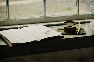
 The car is packed and ready to go, but hubby wasn't here, so I had a little time to play. I coated a textured sheer fabric with Golden Clear Digital Ground, let it dry, and printed this image on it. The fabric came from an interior designer's sample book -- I've never seen a sheer like that in my local fabric store. I love the texture with the photo, although next time I might use a lower opacity for the image (so it wouldn't print as dark and crisp). Try clicking on the photo, I think you'll be able to see the texture.
A whimsical exploration of inspiration and creativity with the fibers that provide me with hours of contentment. Join me on this quilting, mixed-media and jewelry art journey!
Sunday, September 26, 2010
Time to Play!
 The car is packed and ready to go, but hubby wasn't here, so I had a little time to play. I coated a textured sheer fabric with Golden Clear Digital Ground, let it dry, and printed this image on it. The fabric came from an interior designer's sample book -- I've never seen a sheer like that in my local fabric store. I love the texture with the photo, although next time I might use a lower opacity for the image (so it wouldn't print as dark and crisp). Try clicking on the photo, I think you'll be able to see the texture.
Art Quilt Retreat
I'm off to the Sister Art Quilt retreat with Sue Benner. As always, I'm sure I won't have what I need, even though I have everything on the supply list. Isn't it always that way--the perfect bit of fabric is at home! I'll post pictures soon...
Friday, September 24, 2010
Cognitive Dissonance
 I can't remember the first time I came across the term "cognitive dissonance" -- perhaps in a marketing class in business school. Wikipedia defines the term as an uncomfortable feeling caused by holding conflicting ideas simultaneously. At the time, I understood it intellectually, but not from a visceral, personal perspective. That is definitely not the case any more!
For a while now, I've wanted to work in a more abstract/less representational manner. I don't know why, exactly, except to see if I can do it. That's where the dissonance comes in: I think in terms of images and end up being most comfortable portraying and using those images. I don't want my work to look like a scrapbook or a messy, disjointed collage, though, so then what??? I hope that next week's art quilt retreat with Sue Benner will help resolve the dissonance, but I'm a little worried that it will mostly bring frustration and tantrums!
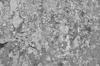
I included the photo above because it is more about texture than portraying anything in particular. I started with a close-up photo of a rusted metal buoy, added more texture, played with blending modes and color, and ended up with this. Is it abstract? I honestly don't know. I could get all philosophical and say it represents aging or global warming or something similar, but it doesn't, at least not to me. It is all about texture and color, and I love it for that. Where it goes from here, who knows???
Wednesday, September 22, 2010
A Clean Studio is a Sign of...
 Some people work well in a chaotic mess, but not me. I tidied my studio up yesterday and feel better already! A pile of fabric moved to the closet (which still needs work, but it is out of sight so it doesn't make me crazy...) so now I just have blue-violet staring me in the face, but it is a nice, polite stare, not an in your face crazy stare! My new books are put away, most of the counter is visible, and I'm ready to rumble. See ya!!!
Sunday, September 19, 2010
Run Faster! Jump Higher!
We had a very wet weekend here in Central Oregon, and normally that would be quilting weather. Not a chance, of course! Our first agility trial was this weekend, so the dogs and I were out in it all day yesterday. When it was even wetter today and my back cramped up, I decided it was time to go home for a nap on the couch instead!
I wasn't sure how Wookie would react to all the dogs and the hubbub of a show, so I just entered Yoda. That turned out to be a "good news, bad news" kind of decision. Wookie really wanted to run and wasn't fazed by anything, while Yoda only "came to work" in half our runs. When we ran well, we ran really well, and when we didn't, we really didn't! He is much faster than Wookie but less focused on me -- when he sees his favorite equipment, he takes off. He ran the dog walk twice on our first run and would have run it again if I hadn't called him off and convinced him that the tunnel really would be fun, too. :-) Even with all that, we got third place on our run and had a good time. Silly dog! He's already gotten more ribbons than I have for my quilts!

I wasn't sure how Wookie would react to all the dogs and the hubbub of a show, so I just entered Yoda. That turned out to be a "good news, bad news" kind of decision. Wookie really wanted to run and wasn't fazed by anything, while Yoda only "came to work" in half our runs. When we ran well, we ran really well, and when we didn't, we really didn't! He is much faster than Wookie but less focused on me -- when he sees his favorite equipment, he takes off. He ran the dog walk twice on our first run and would have run it again if I hadn't called him off and convinced him that the tunnel really would be fun, too. :-) Even with all that, we got third place on our run and had a good time. Silly dog! He's already gotten more ribbons than I have for my quilts!

Friday, September 17, 2010
Extra! Extra! Blog All About It!

Remember my long, skinny violet quilt from ages ago? It and its "Color Cascade" cousins are mentioned in C&T Publishing's blog. Check it out and let me know if you see it at PIQF (Pacific International Quilt Festival).
Monday, September 13, 2010
No Whiners Allowed!
 I've been moving a little slowly the past couple of days but didn't want to whine to you about it (how dull is that, right?) I've gotten a lot done, but you don't want to see boring pictures of my bills, do you??? :-)
So I decided to start a new tradition -- when I finish a quilt project (label, hanging sleeve), I will post my label here. Ta da! I know, I know, took ya long enough! (I posted the picture of the quilt back in February!) This will be part of a special exhibit at the Pacific International Quilt Festival in Santa Clara, CA in October. If you go to the show, take a picture of the exhibit and I'll send you a present...
Good news -- my family is coming up for my b-day party!
Friday, September 10, 2010
Happy (Early) Birthday to Me...
 My "Big 5-0" is rapidly approaching (sigh...) and I'm determined to prolong the festivities as long as possible. It took me this long to get here, might as well enjoy the ride. Ha ha, if anyone wants to send cupcakes, I'm quite fond of chocolate... :-)
Instead of indulging in unneeded calories (which I dearly love but my waistline doesn't need!), I treated myself to TWO presents: Digital Art Studio: Techniques for Combining Inkjet Printing with Traditional Art Materials and Color Efex Pro 3.0 (plug-in filters for Photoshop). Happy Dance -- I can't wait to read and play!
Obsession!

(remember "Tradition" from Fiddler on the Roof? Sing my new "obsession" song with me -- same tune, new words, louder and most definitely not on key!!!)
I have had two obsessions this week -- getting my dogs ready for our first agility trial, and messing around with textures in PSE8. The former leads to happy dogs (CHEESE! HOORAY!), while the latter leads to happy Kathy. They are both good things!
Someone on the Stitchin' Fingers Digital Designers group had a pointer to a tutorial on adding textures in Photoshop, and I've been going nuts finding free textures and adding them to photos ever since! One site that I like is Lost and Taken -- the textures are free for both personal and commercial use and don't require attribution. Be warned, the zip files are large...
I really like the way adding texture can transform an ordinary photo and particularly like creating a vintage look. I have always been a fan of the excess of Victorian era, especially crazy quilts, where enough is never enough! (I'm glad I didn't live then, life generally stunk unless you were wealthy, but for a hand-embroiderer and collector of fiddly bits, it was heaven!)
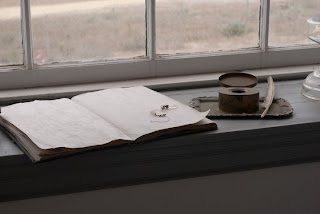
Anyway, I've decided to work in a faded vintage/sepia palette for my Pt. Pinos Lighthouse quilt. I grunged up the photo of the light tower (original shown earlier this month), and this is a companion photo. I layered an antique damask overlay with several other textures, and the fabric texture peeps through in some of the lighter areas (click on the photo to see the larger version and look at the bottom edge of the window frame). It was a cool, overcast day, and the textures warm up the final image, while adding a few scratches and age marks. Fun fun fun!

Thursday, September 9, 2010
A Quilter's Milestone
Finished off my first box of freezer paper today! None of it has seen the inside of my freezer, but lots of paint, templates, etc. Had to run out and buy a new box -- think I'll put today's date on it so I know how long it lasts. :-)
Sunday, September 5, 2010
Sewing Frog Says "Rip-It, Rip-It!"
 This is my friend Patty's birthday block. She provided the dark blue batik and gave us the theme "Midnight in the Garden." Since she's a devout Christian lady, I made a palm leaf block. Or should I say, made and re-made and made again! I started with a fat quarter of the teal green and ended up with scraps since I made a few mistakes. That's what I get for rushing.
 First I had the dark and light mixed up and had to start over since there is no way I was ripping out all those tiny foundation-pieced stitches! Then I cut piece #3 too short and had to start over. The third time was a charm -- I hope she likes the block after all that!
Pumpkins and Onions and Stuff, Oh, My!
 With apologies to The Wizard of Oz... :-)
This book arrived in the mail this week and I've enjoyed reading it, in spite of myself! Even though I have a huge fabric stash and extensive collections of embroidery threads and beads, I don't have a "magpie mind" -- I like things neat and tidy. Collecting bits and pieces of stuff makes me crazy, and scribbling with the sewing machine, well, we won't go there... So why do I want to drop everything to make a 3D piece like her papier mache boxes???

The same for the pumpkins in the Sept./Oct. issue of Cloth Paper Scissors. I'm not particularly fond of Halloween, and the big pumpkin kind of gives me the heebee geebies, but I really want to buy some plaster cloth and try covering something! What's up with that???
Saturday, September 4, 2010
Color, Magical Color
 FedEx brought the "Complete Color Index" by Jim Krause today and I'm having great fun looking through it and playing with colors in PSE8. It is a boxed set that comes with two paperbacks featuring over 2600 color combinations. Each color combo has up to 4 colors in differing amounts; the entry includes the RGB and CMYK values for each color. Enter the RGB value in the PSE Color Picker and that color is available for use in brushes, fills, etc.
Rummaging around on my bookshelf produced a similar series called "The Designer's Guide to Color Combinations" by Leslie Cabarga (the image above is from the sequel featuring global combos). What I like about these is that the sample combos are a little larger (44mm x 52mm vs. 20mm x 29mm) and feature up to 8 colors. The Global book features artwork (ads, beaded bags, paintings, wallpaper, etc.) from around the world -- it is useful to compare the color swatches (with each color shown in the equal amounts) with the actual item and see which colors are most prominent.

Okay, Kath, what's your point? Why should I bother with any of these? :-) If you're anything like me, you have favorite color schemes that you use again and again, but what if we wanted to try something different? I'm not a huge fan of pure, bright yellow (it is fine in children's quilts...), but I love some of the palettes in the scan above. Any one could easily be the start of a palette for a scrap quilt, digital composition, beaded bracelet, etc.
(I bought all these books with my own money and no one is paying me to say anything nice about them!) So there...
Thursday, September 2, 2010
Who Wants a Present???
 This postcard started with the poppy seed packet and grew from there. I found the bird (it was red!), which led to music for the bird to sing, etc. I selected a few more fun images, printed the resulting digital collage on photo fabric, hand-stamped the green doodle in the bottom right-hand corner, added some hand embroidery and a glitzy crystal flower and there you have it!
I've never done a give-away, but it sounds like fun -- we all like to get cool stuff in the mail, right? :-) Assuming that I could wave a magic wand and plop you in front of a post office anywhere in the world (to send this card, of course!), where would that be and why? Please post a comment and I will select a winner this coming Sunday morning between 9 and 10AM PDT (or as soon as possible after I get back from walking the dogs!). Cheers!
Wednesday, September 1, 2010
More Back to School Fun with PSE8
 I got some great texture photos at Pt. Pinos, and wanted to create a texture brush using one of them. I modified the steps for PSE8 (instead of full Photoshop) from a Bittbox tutorial (I used guided edit to change to black and white). The process was easy and my brush is very cool.
As an aside, a brush can be up to 2500 pixels wide or tall, which is slightly larger than a standard 4" x 6" postcard (resize the brush to 2410 pixels, and it fits perfectly on the 6" dimension, with a little extra on the 4" side).
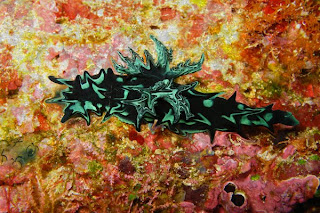
When I showed the original nudibranch photo to my photo group, they didn't realize the background was an encrusted substrate (translation: lots of colorful junk growing on a rock!). Some of the background was a little too bright as well, so I used my brush to tone down the brightness and add a little bit of organic texture so the background looks more "real." I also used the Liquify filter on the critter to add little spikes and fluff up the gills even more. It still isn't abstract, but I LOVE it!

Subscribe to:
Comments (Atom)